One Cure
Returning to our roots. Revolutionizing tradition.


Challenge
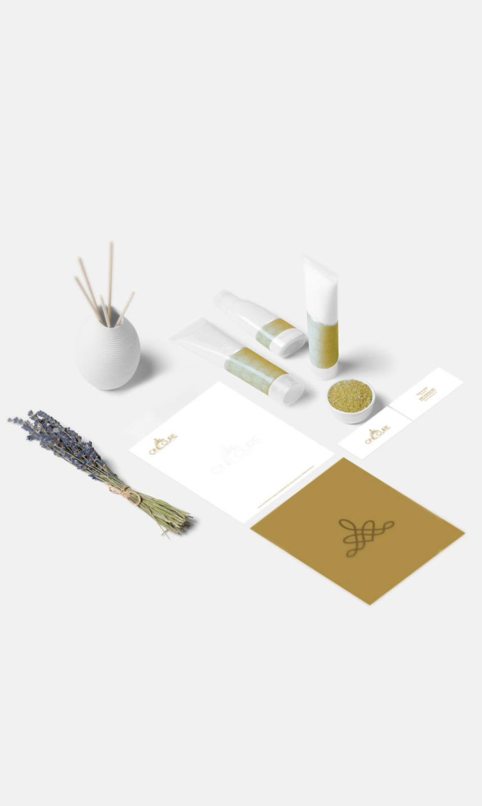
The challenge was to design a distinctive brand identity for an Australian company offering premium beauty spa products.
MJBC played a key role in shaping a narrative that harmonized traditional wellness rituals with sleek, modern aesthetics. By blending luxury with sustainability, I created a brand story that resonates deeply with today’s discerning, conscious consumers.

Solution
The path was clear: to seamlessly integrate the essence of Ayurveda into the brand identity.
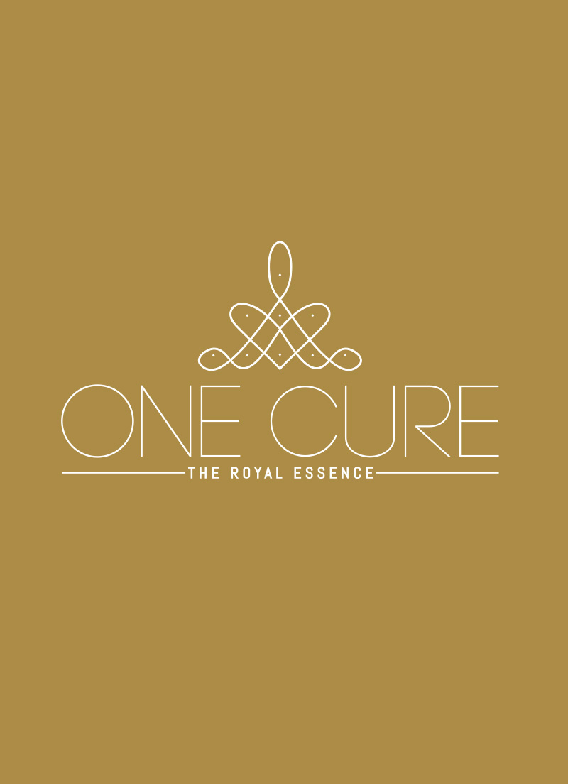
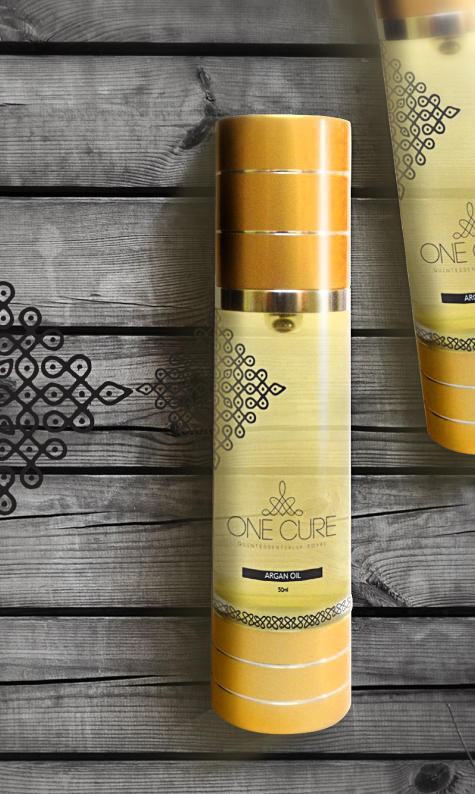
The brand name, “One Cure,” inspired by the ‘ottamooli’ practice of Ayurveda, encapsulates the power of a single ingredient to address various ailments. The logo’s overall shape symbolizes a mediating monk, paying tribute to Adi Shankara, whose philosophical insights underpin much of modern Indian thought. Additionally, the crown motif in the shape signifies the brand’s royal heritage. The logo has also taken inspiration from the ‘Nilavilakku’ conveying spirituality, purity, and wealth, while the geometric patterns reflect Kolam, a traditional ornamental floor design used in ceremonies and festivals. The logo also features leaf-like structures, symbolizing the revered neem leaves in Ayurveda. Neem, known as “Sarva Roga Nivarini” or “the healer of all ailments,” has been celebrated for thousands of years for its potent medicinal properties. This thoughtful design approach beautifully intertwines tradition with modernity, creating a brand that is both authentic and visually striking.

Result
MJBC dedicated countless hours to in-depth research, which played a pivotal role in crafting the brand name and logo.
From developing the tagline to selecting the brand colors, this meticulous process ensured that every detail reflected the brand’s core essence, rooted in a deep understanding of Ayurveda and its rich cultural heritage. The result was a brand identity that felt both authentic and timeless embracing culture.
Moulding a brand from its foundation, capturing its roots


